
The Charts Just Issued a Technical Warning: The S&P 500 Is Losing the Battle
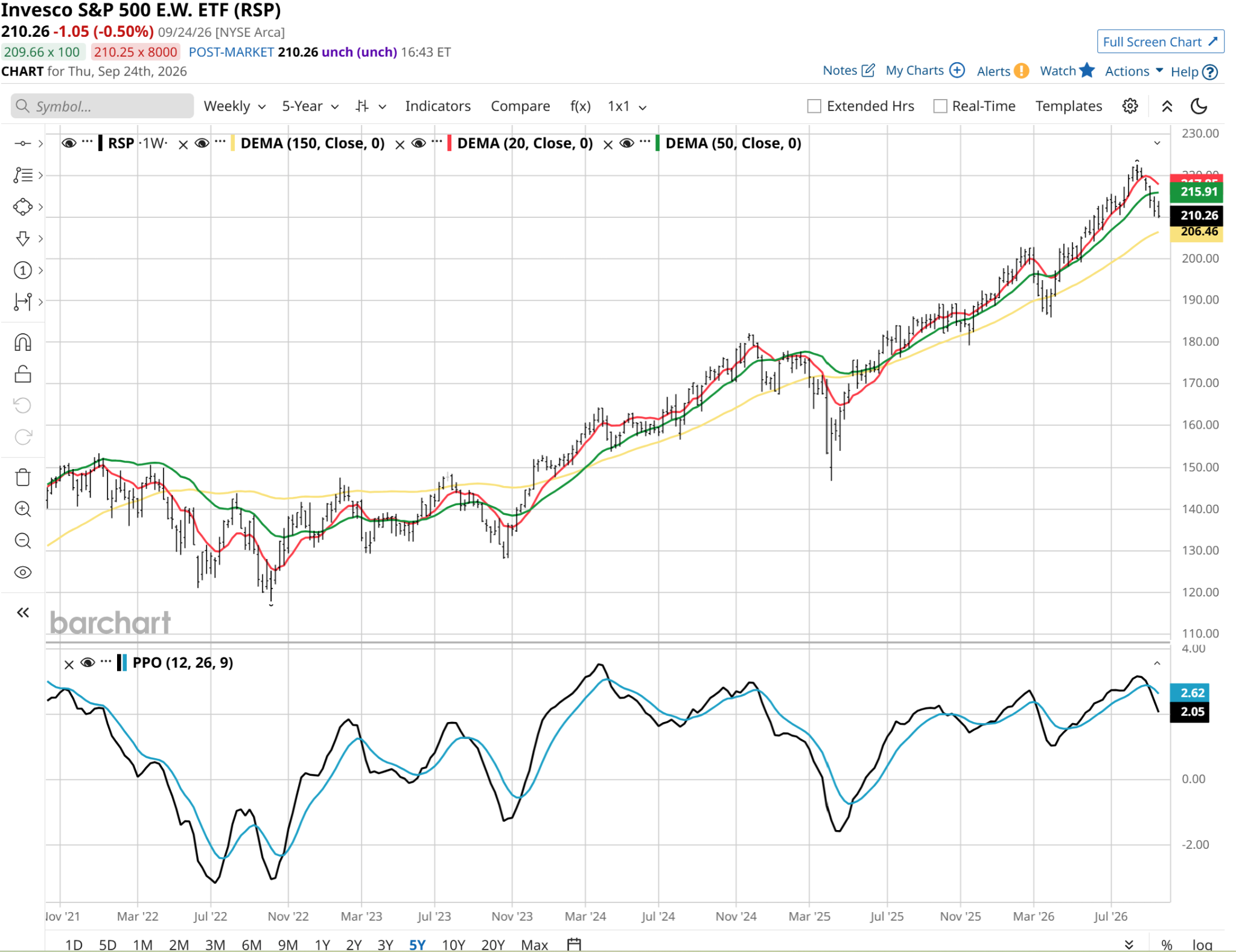
After 40 years of charting stocks and funds, when I see a chart that looks like the one below, I often don’t even care about the ticker. To technical analysts, a chart is a chart. We can combine our views of many different charts at the same point in time to evaluate the broader market.
It turns out this is the chart of the Invesco S&P 500 Equal Weight ETF (RSP), which I view as an ETF that tells us how the average S&P 500 Index ($SPX) stock is doing. In a market this top-heavy, RSP is as important an indicator to me of market health as any. And it is in big trouble.
This chart should be particularly concerning to bulls. The lower portion of the chart shows a percentage price oscillator (PPO) momentum indicator that continues to try and fail to bottom. We are weeks into this process, and during that time, the 20-day moving average (in red) has been joined in its downward trend by the 50-day moving average (in green).

This weekly chart only adds to my opinion that the RSP better hustle up its little booty and reverse this slide. Or it could become a big slide. And drag the headline SPDR S&P 500 ETF (SPY) with it.
If you look at the far right of this weekly chart, you will see a familiar pattern in the PPO.
The ROAR Score I created in order to automate technical analysis is a good guide here. The score was happily in the green/lower risk zone throughout RSP’s move up from $200 a share starting this past April.
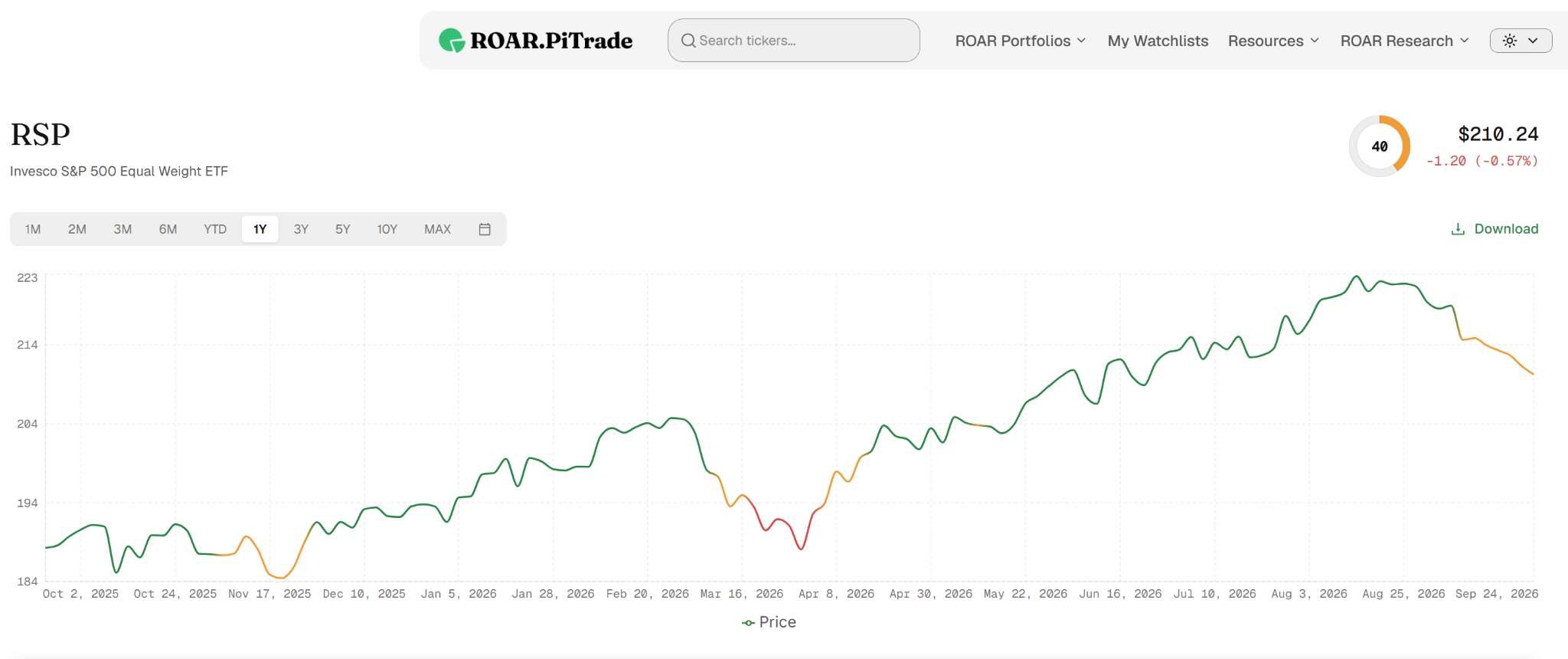
But more recently, it turned yellow, indicating more neutral risk versus upside potential. In other words, just as I noted above, all is not lost. But there could be a lot more loss if some type of sustained reversal happens soon.
It helps to see just how weak RSP has been versus SPY for a while now. Even with the current P/E ratio in a similar range, it has underperformed SPY consistently. We all know why. Mag 7, AI trade, whatever you prefer to call it.
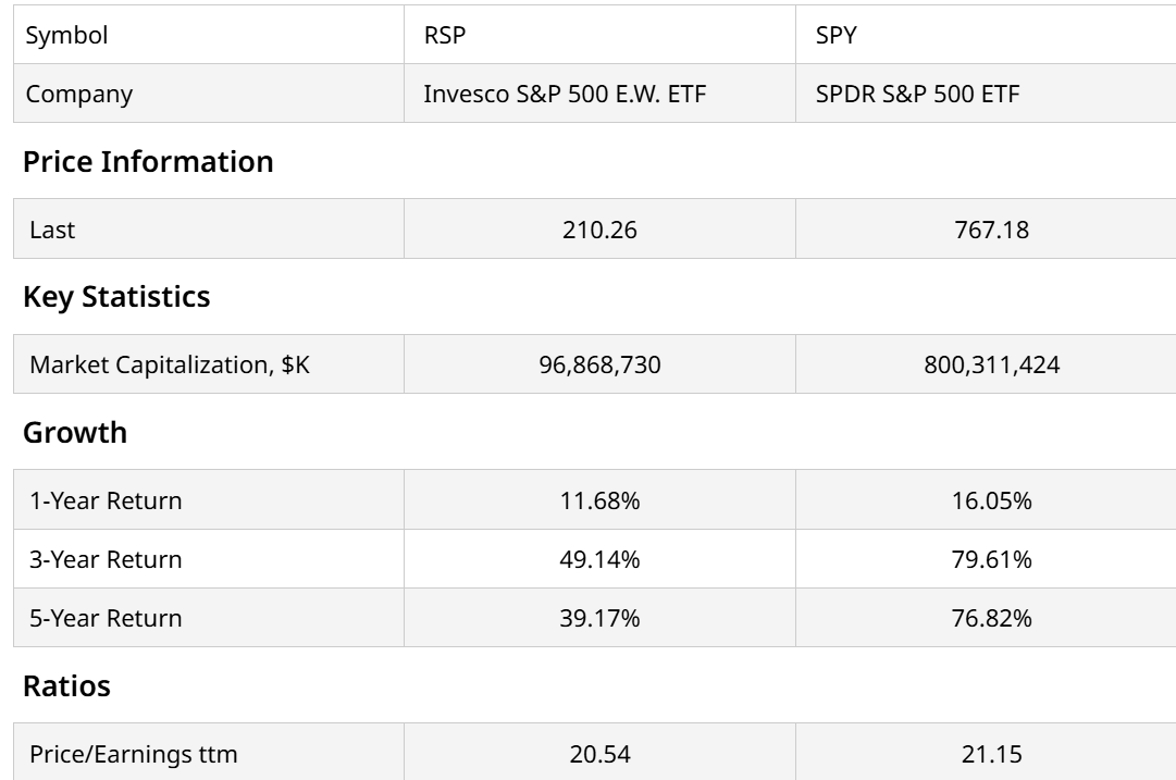
OK, so RSP has been a laggard. But when I add that to my view of its chart, that leads to two possibilities.
- RSP is leading SPY down or
- Most of the S&P 500 stocks are useless to broad market investors
The historical correlation between RSP and SPY usually sits near a tight 0.93. Recently, that correlation has collapsed down toward 0.73. When an equal-weight index decouples from its cap-weighted twin, it signals to me that the broader economy is decoupling from the handful of tech names keeping the headline market afloat. I’m visualizing sand, slowly draining through the top of an hourglass to the bottom half.
Why Are the Charts Tipping Me Off Now?
Elevated borrowing costs, compressed profit margins, exhausted consumers. Those are the first three I think of. And it shows in the brutal performance of consumer-sensitive stocks. Financial and utility stocks too.
What should a trader or investor do about it? That depends on how you like to play defense. If you go through the process of learning to hedge, the next step of this cycle could be a nice time to make profits. Otherwise, there’s cash-like ETFs such as the iShares 0-1 Year Treasury Bond ETF (SHV), the iShares 0-3 Month Treasury Bond ETF (SGOV), and the State Street SPDR Bloomberg 1-3 Month T-Bill ETF (BIL). Either way, it is best not to ignore what’s happening with RSP.
Rob Isbitts is a semi-retired CIO, former fiduciary investment advisor, and Barchart columnist. Check out his other work at ETFYourself.com (featuring the Fresh Charts weekly trading post), and ROAR.PiTrade.com, helping investors to better-manage their own portfolios.
On the date of publication, Rob Isbitts did not have (either directly or indirectly) positions in any of the securities mentioned in this article. All information and data in this article is solely for informational purposes. For more information please view the Barchart Disclosure Policy here.