
TPO Charts Explained
Adding TPO Indicator on Desktop
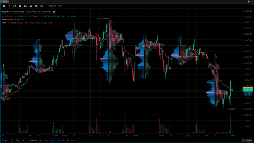
To add TPO and Volume Profiles to your charts, select the “Order Flow” icon next to Replay at the top left of your chart, then select “TPO”:
Key Elements of TPO Charts
Instead of candles, TPO charts display letters or blocks to represent each time period a price level was traded. For example, the first 30-minute bracket of the session is labeled “A”, the next “B”, and so on. When a price is visited across multiple time brackets, those letters stack , creating a visual map of market activity.
- Point of Control (POC): The price level where the market spent the most time during the session.
- Value Area (VA): The range where 70% of the trading activity took place.
- Initial Balance (IB): The price range of the first 1-2 hours of trading (customizable), often representing emotional or impulsive moves. Traders look to these as potential support or resistance areas, and track if trends occur form this range or not.
- Single Prints: Price levels where only one TPO is recorded, meaning the market has traded at that price only once during the specified time period. Traders interpret single prints in a variety of ways, such as market imbalance.
- Developing Profile: Updated dynamically during the session to show evolving structure.
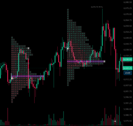
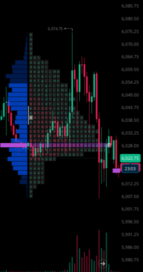
Example of TPO 30 minute intervals on /ES. Green & red blocks represent the TPO Profile, and the purple line you see is the POC.
What is a Volume Profile?
A Volume Profile is similar to a TPO chart, but instead of measuring time, it tracks volume traded at each price level. This makes it especially valuable for spotting where buyers and sellers are most active and where large institutional orders may have taken place.
Key Elements of Volume Profile:
· Volume Point of Control: The price with the highest traded volume.
· Value Area: Usually the price range where 70% of the total volume occurred
· High Volume Nodes (HVNs): Price levels with significant volume, often acting as magnets or support/resistance.
· Low Volume Nodes (LVNs): Price levels with little interest; often lead to price rejection or fast moves through these areas.
Traders often track these key levels throughout the session, helping them identify potential accumulation or distribution zones.
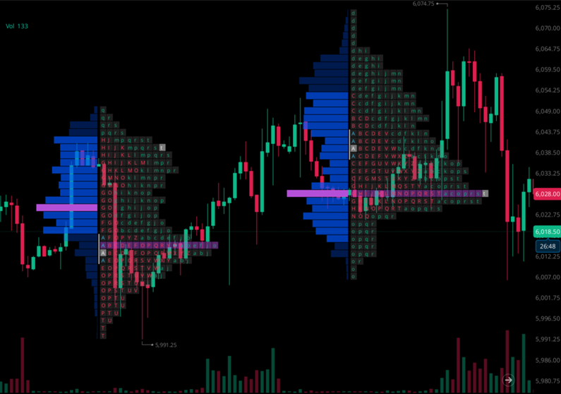
Volume Profile is to the left, with TPO on the right. The Volume Value Area is brighter blue, with Volume POC highlighted in pink.
How Traders Use TPO and Volume Profile Charts
Professional traders often use TPO and Volume Profile side by side to gain insight into the market’s underlying structure. These tools help define whether the market is balanced (consolidating) or imbalanced (trending), and help traders anticipate potential breakout or reversal points.
Example: Identifying Responsive vs Initiative Trades
Let’s look at a simplified approach based on Volume Profile:
Setup: Reversion-to-Mean Trade from Value Extremes
- Identify the extremes of the Value Area, where the highest price in the VA represents the Value Area High (VAH) and the lowest price represents the Value Area Low (VAL).
- Watch to see if price moves to one of these extremes, planning your entry and stop accordingly.
- Establish a long or shot position and your take profit price around Volume POC.
This type of price action can be referred to as “responsive”, where participants fade the extremes and bring price back to fair value. In contrast, if prices breaks out of value and builds acceptance (via volume or time), it may signal an initiative move and the start of a trend.
Example of responsive behavior. You can clearly see the failed breakout/start of trend higher, and the market returning back to fair value. In this case, the market auctioned right back towards the final POC & Volume POC.
Why These Tools Matter
Most traders focus solely on price, but professionals look at where and how long the market is accepting price. That’s where TPO and Volume Profile charts shine. They help traders:
- Identify balance and imbalance
- Locate high-probability support/resistance zones
- Understand intraday sentiment shifts
- Time entries around volume-based structures, not just candlestick patterns
Final Thoughts
TPO and Volume Profile charts shift your perspective from chasing price to observing market structure. They offer context, where the crowd is comfortable (value), where price is being accepted or rejected, and where the next move is likely to unfold. While they may see complex at first, with practice these tools can help traders anticipate and understand the auction process behind market moves.
Adding TPO and Volume Profile to your charts can help you identify and execute more informed trades. Try pairing these with other technical tools like VWAP and moving averages.