'%3e %3cpath d='M41.7832962%2c0 C41.9459106%2c0 42.0882746%2c0.0866854658 42.1666825%2c0.216359069 C43.8289923%2c2.66540836 44.7676281%2c5.46271319 44.7676281%2c8.43208061 C44.7676281%2c18.1345746 34.7460532%2c26 22.383814%2c26 C10.0215749%2c26 0%2c18.1345746 0%2c8.43208061 C0%2c5.46716016 0.935826425%2c2.67378733 2.58829888%2c0.223985685 C2.67109477%2c0.0916264068 2.81687473%2c0 2.9840593%2c0 C3.23130408%2c0 3.43173558%2c0.200393004 3.43173558%2c0.447590303 C3.43173558%2c0.475056669 3.42926112%2c0.501945205 3.42452292%2c0.528045226 L3.41810883%2c0.550292077 C3.37800671%2c0.861741908 3.3575721%2c1.17661276 3.3575721%2c1.49443092 C3.3575721%2c7.98336 11.2132389%2c12.5742305 22.383814%2c12.5742305 C33.5543891%2c12.5742305 41.410056%2c7.98336 41.410056%2c1.49443092 C41.410056%2c1.17865223 41.3898828%2c0.865783153 41.3502888%2c0.556288325 C41.3402868%2c0.521941442 41.3356199%2c0.48531078 41.3356199%2c0.447590303 C41.3356199%2c0.200393004 41.5360514%2c0 41.7832962%2c0 Z' id='logo%e5%a4%87%e4%bb%bd-6' fill='white'%3e%3c/path%3e %3cpath d='M74.6899231%2c3.74404927 C75.2411227%2c3.74404927 75.7734299%2c3.66184338 76.2756219%2c3.50883715 L73.8159676%2c20.8666902 C73.5770593%2c22.5662954 72.8072434%2c23.0518969 71.4268838%2c23.0518969 L69.9934336%2c23.0518969 C68.7988917%2c23.0518969 68.1618027%2c22.458384 67.7901674%2c20.893668 L65.6930827%2c11.9909739 C65.639992%2c11.7481731 65.639992%2c11.6942174 65.5338105%2c11.6942174 C65.427629%2c11.6942174 65.4010836%2c11.7481731 65.3479929%2c11.9909739 L63.2509082%2c20.893668 C62.8792729%2c22.458384 62.2421839%2c23.0518969 61.047642%2c23.0518969 L59.6141918%2c23.0518969 C58.2338322%2c23.0518969 57.4640163%2c22.5662954 57.225108%2c20.8666902 L54.7463723%2c3.37406084 C55.3593498%2c3.61307396 56.0249975%2c3.74404927 56.7207458%2c3.74404927 C57.3314263%2c3.74404927 57.918917%2c3.64314414 58.4679557%2c3.4568446 L60.3574623%2c19.3829078 C60.3840076%2c19.6257086 60.3840076%2c19.7875757 60.4901891%2c19.7875757 C60.5963706%2c19.7875757 60.5963706%2c19.6257086 60.6494614%2c19.3829078 L62.9323637%2c9.91367858 C63.0916359%2c9.26620991 63.4632712%2c8.69967483 64.6047223%2c8.69967483 L66.4363532%2c8.69967483 C67.5778044%2c8.69967483 67.9494397%2c9.26620991 68.1087119%2c9.91367858 L70.3916142%2c19.3829078 C70.4447049%2c19.6257086 70.4447049%2c19.7875757 70.5508864%2c19.7875757 C70.6570679%2c19.7875757 70.6570679%2c19.6257086 70.6836133%2c19.3829078 L72.5891207%2c3.32292288 C73.2365902%2c3.59432921 73.9460524%2c3.74404927 74.6899231%2c3.74404927 Z' id='Combined-Shape' fill='white'%3e%3c/path%3e %3cpath d='M84.5933901%2c7.43171536 C88.6813779%2c7.43171536 90.9111894%2c10.2643908 90.9111894%2c14.2840921 L90.9111894%2c15.7948523 C90.9111894%2c16.2264981 90.7519172%2c16.4692988 90.3802819%2c16.4692988 L81.7264895%2c16.4692988 L81.7264895%2c16.5502324 C81.7264895%2c18.1149484 82.3635785%2c19.9764208 84.9119346%2c19.9764208 C86.849747%2c19.9764208 88.6813779%2c19.8145536 89.7962837%2c19.7066422 L89.8759198%2c19.7066422 C90.1413735%2c19.7066422 90.3537366%2c19.8415315 90.3537366%2c20.1113101 L90.3537366%2c21.8918489 C90.3537366%2c22.3234947 90.2741004%2c22.5123397 89.7962837%2c22.5932733 C88.0708343%2c22.9170076 87.0355646%2c23.0518969 84.6464808%2c23.0518969 C81.9919433%2c23.0518969 78.2225%2c21.5950924 78.2225%2c16.2804538 L78.2225%2c14.2840921 C78.2225%2c10.0755457 80.5319476%2c7.43171536 84.5933901%2c7.43171536 Z M84.5933901%2c10.5071915 C82.9475768%2c10.5071915 81.7530349%2c11.6942174 81.7530349%2c13.8254684 L81.7530349%2c13.9333799 L87.3806545%2c13.9333799 L87.3806545%2c13.8254684 C87.3806545%2c11.7211953 86.2392034%2c10.5071915 84.5933901%2c10.5071915 Z' id='Combined-Shape' fill='white'%3e%3c/path%3e %3cpath d='M97.4154906%2c2.98826245 L97.4148064%2c7.62056039 C98.3969853%2c7.48567108 99.3260735%2c7.43171536 99.9631625%2c7.43171536 C104.236968%2c7.43171536 106.307507%2c9.99461216 106.307507%2c14.2031585 L106.307507%2c16.2804538 C106.307507%2c20.4890001 104.236968%2c23.0518969 99.9631625%2c23.0518969 C98.2642584%2c23.0518969 96.2733553%2c22.7821183 94.627542%2c22.3504725 C94.0169984%2c22.1886054 93.9108169%2c22.0267382 93.9108169%2c21.6220703 L93.9098179%2c3.08694115 C94.4185466%2c3.24434375 94.9584615%2c3.32900525 95.5178331%2c3.32900525 C96.184659%2c3.32900525 96.8238351%2c3.20869291 97.4154906%2c2.98826245 Z M99.9631625%2c10.3453244 C99.3260735%2c10.3453244 98.1580769%2c10.4262579 97.4148064%2c10.5341694 L97.4148064%2c19.9494429 C97.9191686%2c20.0573544 99.007529%2c20.1382879 99.9631625%2c20.1382879 C102.246065%2c20.1382879 102.803518%2c18.4926384 102.803518%2c16.2804538 L102.803518%2c14.2031585 C102.803518%2c11.9909739 102.246065%2c10.3453244 99.9631625%2c10.3453244 Z' id='Combined-Shape' fill='white'%3e%3c/path%3e %3cpath d='M111.036668%2c8.72457747 C111.579488%2c8.72457747 112.103987%2c8.64485191 112.599444%2c8.49629404 L112.598761%2c16.5232546 C112.598761%2c19.3289521 113.607485%2c19.9764208 115.147117%2c19.9764208 L115.306389%2c19.9764208 C116.846021%2c19.9764208 117.854746%2c19.3289521 117.854746%2c16.5232546 L117.854207%2c8.4334735 C118.406525%2c8.62226395 118.997939%2c8.72457747 119.612866%2c8.72457747 C120.223332%2c8.72457747 120.810625%2c8.62374317 121.359498%2c8.43756894 L121.358735%2c16.5232546 C121.358735%2c22.4044283 116.872567%2c23.0518969 115.306389%2c23.0518969 L115.060464%2c23.0512514 C113.42215%2c23.0271041 109.094772%2c22.2994073 109.094772%2c16.5232546 L109.094446%2c8.36700801 C109.698522%2c8.59813531 110.353066%2c8.72457747 111.036668%2c8.72457747 Z' id='Combined-Shape' fill='white'%3e%3c/path%3e %3cpath d='M128.314162%2c3.03790128 L128.313623%2c22.269539 C128.313623%2c22.5662954 128.10126%2c22.836074 127.809261%2c22.836074 L125.340541%2c22.836074 C125.048542%2c22.836074 124.809634%2c22.5662954 124.809634%2c22.269539 L124.809455%2c3.04219481 C125.358161%2c3.22824247 125.945253%2c3.32900525 126.555503%2c3.32900525 C127.17043%2c3.32900525 127.761844%2c3.22669173 128.314162%2c3.03790128 Z' id='Combined-Shape' fill='white'%3e%3c/path%3e %3cpath d='M133.90653%2c3.32900525 C134.473329%2c3.32900525 135.02015%2c3.24208064 135.534793%2c3.08063296 L135.533966%2c22.269539 C135.533966%2c22.5662954 135.321603%2c22.836074 135.029603%2c22.836074 L132.560884%2c22.836074 C132.268884%2c22.836074 132.029976%2c22.5662954 132.029976%2c22.269539 L132.029909%2c2.99605058 C132.615669%2c3.21152525 133.2476%2c3.32900525 133.90653%2c3.32900525 Z' id='Combined-Shape' fill='white'%3e%3c/path%3e %3c/g%3e %3c/g%3e %3c/g%3e%3c/svg%3e)



A candlestick chart is a foundational tool in technical analysis, helping traders and investors quickly assess price movements and market sentiment. By illustrating the open, high, low, and close prices for a specific period, a candlestick chart offers deeper insights than standard line graphs. Understanding various candlestick chart patterns, such as bullish candlestick patterns and bearish formations, can help you navigate market volatility and make informed trading decisions.
Key Takeaways
A candlestick chart displays the open, high, low, and closing prices of an asset over a specific time frame.
The color and length of the candlestick body indicate the strength of bullish or bearish momentum.
Recognizing candlestick chart patterns, such as the Doji or Triple Top, helps traders identify potential market reversals or continuations.
Integrating charting tools on regulated platforms can assist in technical analysis and strategy development.
Part 1. Understanding the Anatomy of a Candlestick Chart
To effectively analyze market trends, it is crucial to understand the historical context and structural components of a candlestick chart.
1.1 The History of Candlesticks
Candlestick charts were developed in the 18th century in Japan by Munehisa Homma, a prominent rice trader. Homma recognized that market prices were driven not only by supply and demand but also by trader psychology and the balance of power between buyers (bulls) and sellers (bears). By studying historical price changes, he identified patterns that signaled shifts in sentiment. This structured approach to market analysis was later introduced to Western financial markets in the late 20th century by technical analysts like Steve Nison. Today, the candlestick chart is widely used across equities, commodities, and foreign exchange markets.
Investopedia — https://www.investopedia.com/trading/candlestick-charting-what-is-it/
1.2 Components of a Candlestick
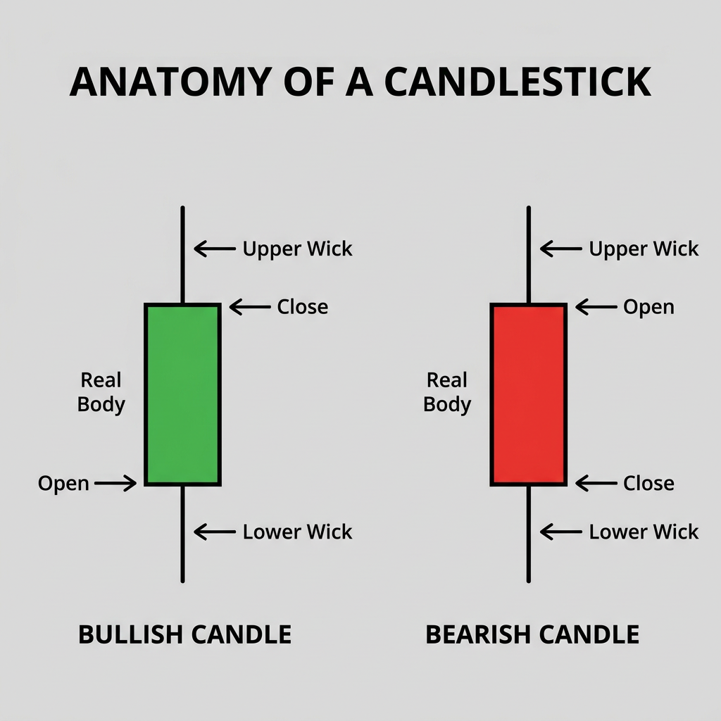
Every individual candle on a candlestick chart represents a specific trading period and consists of three primary components:
The Real Body
The rectangular section is known as the real body. It represents the range between the opening and closing prices. A long body indicates strong buying or selling pressure, whereas a short body suggests market indecision or consolidation.
Wicks and Shadows
The thin lines extending above and below the real body are called wicks or shadows. The upper wick marks the highest price reached during the period, while the lower wick marks the lowest price. Long wicks indicate that prices extended well beyond the opening and closing levels, reflecting higher volatility.
Color Indicators
The color of the candlestick provides a quick visual cue regarding price direction. A bullish candlestick is typically colored green or white, indicating that the closing price was higher than the opening price. Conversely, a bearish candlestick is usually red or black, signifying that the closing price was lower than the opening price.
Britannica — https://www.britannica.com/money/candlestick-pattern-charts
Part 2. Common Candlestick Chart Patterns
Traders rely on specific candlestick chart patterns to gauge potential market turning points. These patterns are generally categorized into bullish, bearish, and indecision formations.
2.1 Bullish Candlestick Patterns
Bullish patterns often appear after a downtrend and may signal a potential upward price reversal.
Bullish Engulfing Pattern
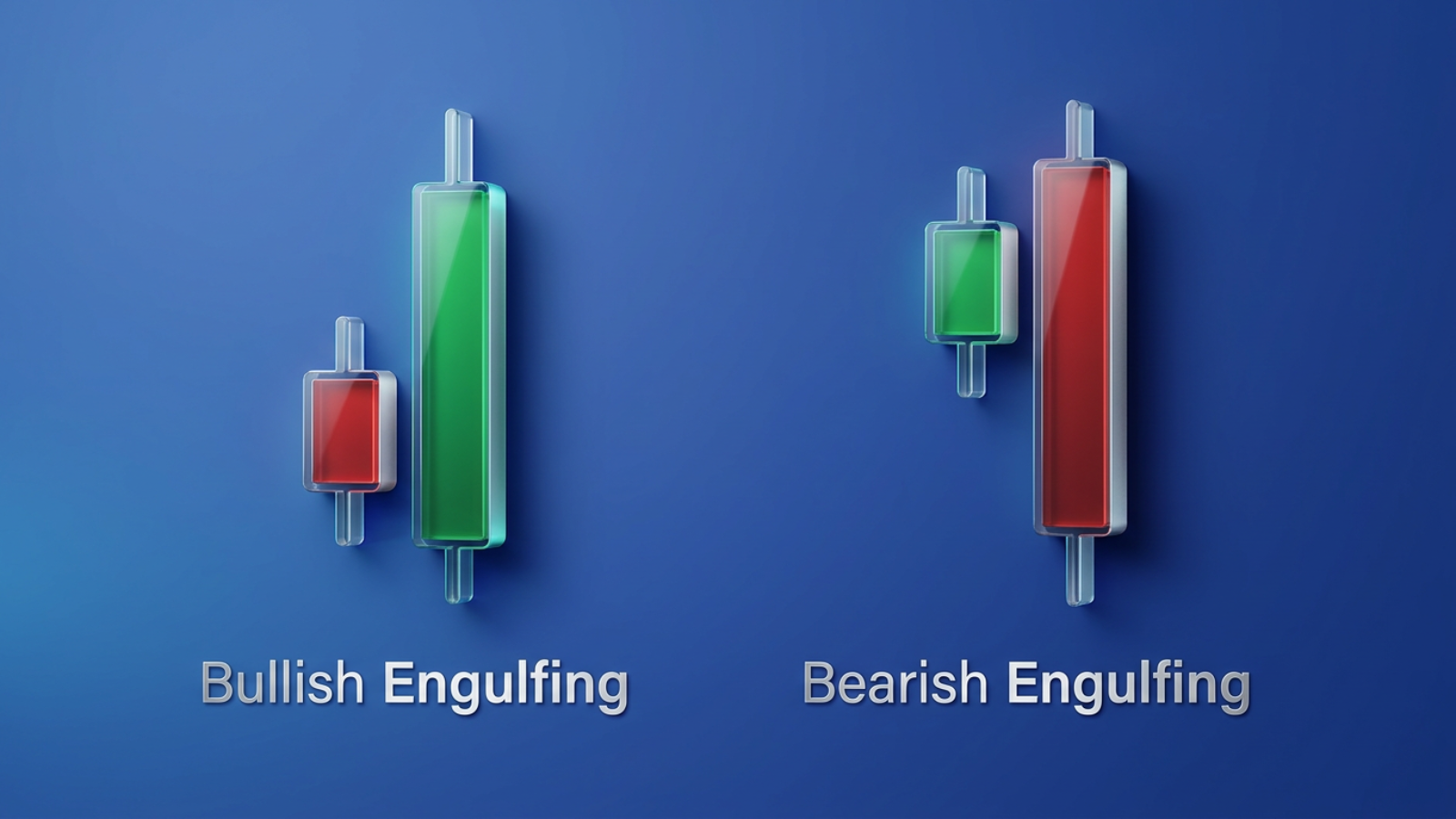
This two-candle pattern starts with a smaller bearish candle, followed by a larger bullish candle that completely engulfs the real body of the first. It indicates that buyers have absorbed the selling pressure and are taking control of the market momentum.
Hammer
The Hammer consists of a small real body with a long lower shadow and little to no upper shadow. Appearing after a price decline, the long lower shadow implies that sellers drove prices down during the session, but buyers regained their footing to push the price back near the open.
2.2 Bearish Candlestick Patterns
Bearish patterns can occur after an uptrend and are generally characterized by increased downward price movement within the observed period. Their appearance alone dose not determine futur price direction.
Bearish Engulfing Pattern
This pattern features a small bullish candle followed by a larger bearish candle that completely engulfs the previous candle's body. It suggests a shift in sentiment where sellers are beginning to overpower buyers.
Shooting Star
A Shooting Star has a small real body, a long upper shadow, and a small or nonexistent lower shadow. It forms after an advance, indicating that buyers attempted to push the price higher, but sellers aggressively drove it back down before the close.
Triple Top Reversal
The Triple Top is a prominent bearish reversal pattern indicating a potential transition from an uptrend to a downtrend. It comprises three sharp peaks at roughly the same resistance level, separated by rounded valleys. The pattern is confirmed when the price breaks below the lowest low of the formation (the confirmation point). A valid breakout is typically accompanied by a burst in volume. The longer the Triple Top takes to form, the more significant the potential price move once the breakout occurs.
2.3 Indecision Patterns: The Doji
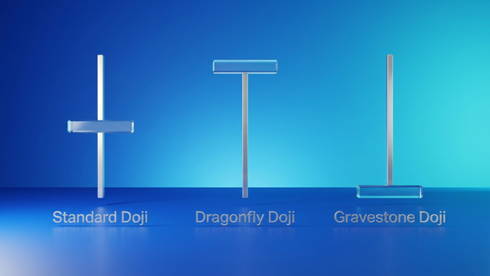
A Doji forms when an asset's opening and closing prices are virtually identical, resulting in a very small or nonexistent real body. It reflects a tug-of-war between buyers and sellers, ultimately ending in a standoff.
Dragonfly Doji
This variation features a long lower shadow and no upper shadow, looking like a "T". It shows that sellers drove prices lower, but buyers pushed them back to the opening level by the close.
Gravestone Doji
Appearing as an upside-down "T", the Gravestone Doji has a long upper shadow and no lower shadow. It indicates that buyers pushed prices higher, but sellers eventually forced the price back down to the open.
StockCharts — https://chartschool.stockcharts.com/table-of-contents/chart-analysis/candlestick-charts/introduction-to-candlesticks
Part 3. Candlestick Charts vs. Line and Bar Charts
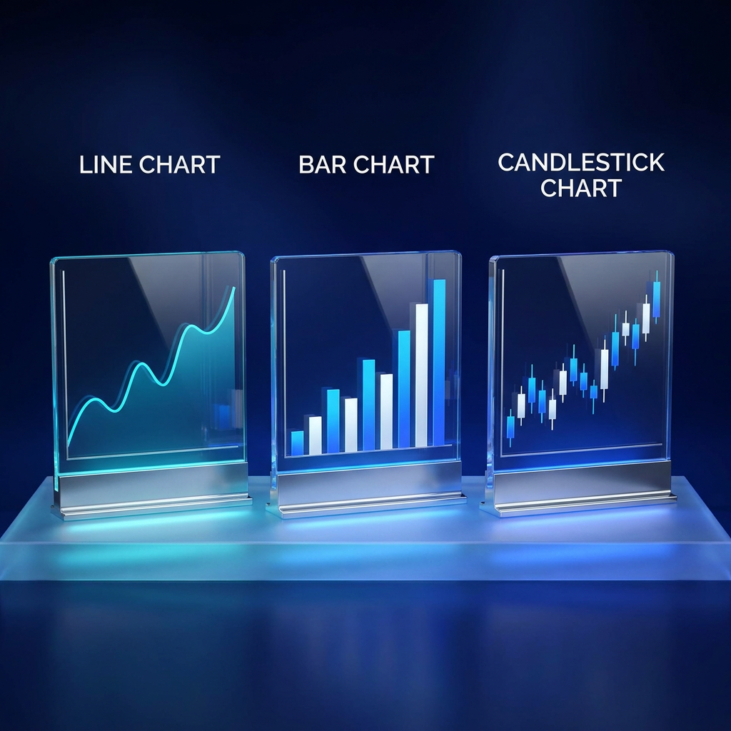
While a candlestick chart is a favored tool for many, technical analysts also use line and bar charts depending on their goals.
3.1 Comparing Chart Types
Line Charts
A line chart connects the closing prices of an asset over a set time frame. It offers a clean, straightforward view of the long-term trend but lacks the detailed intraday information regarding volatility, highs, and lows.
Bar Charts (OHLC)
Bar charts display the Open, High, Low, and Close (OHLC) for a period. A small horizontal tick on the left indicates the open, while a tick on the right indicates the close. While bar charts provide the same raw data as a candlestick chart, they are often considered less visually intuitive when identifying market sentiment at a glance.
CME Group — https://www.cmegroup.com/education/courses/technical-analysis/chart-types-candlestick-line-bar
Feature | Candlestick Chart | Bar Chart | Line Chart |
|---|---|---|---|
Price Points Displayed | Open, High, Low, Close | Open, High, Low, Close | Close Only |
Visual Clarity of Sentiment | High | Moderate | Low |
Ease of Pattern Recognition | Strong | Strong | Weak |
3.2 Practical Applications
Traders and investors analyze candlestick patterns to determine whether a market is trending. They are best used in conjunction with technical indicators such as the Average Directional Index. Additionally, used with other technical analysis tools as well as support and resistance levels, candlestick formations can flag and confirm short-term market turning points.
Investopedia — https://www.investopedia.com/trading/candlestick-charting-what-is-it/
Part 4. How to Analyze a Candlestick Chart on Brokerage Platforms
Choosing the right platform is essential for effectively utilizing a candlestick chart. Traders evaluate brokerages based on their charting capabilities, execution speed, and regulatory compliance.
4.1 Webull: Candlestick Charting Tools
When evaluating technical analysis tools, Webull offers technical charting tools that include various indicators and customizable timeframes. Users can access these features directly at www.webull.com. The platform provides functionalities for analyzing price action, allowing traders to observe candlestick chart patterns across intervals ranging from 1-minute to monthly views. Traders can overlay moving averages, volume profiles, and trendlines to evaluate formations such as the Triple Top or Doji.
Webull supports multiple use cases, from analyzing long-term equity trends to day trading assets. You can learn more about these capabilities at www.webull.com. Webull is a registered broker-dealer, member of FINRA and SIPC, and registered with the SEC, providing a regulated environment for market participants. Security and platform safety are prioritized, allowing users to execute technical strategies.
Rates vary by service provider; please refer to the latest pricings. Past performance is not indicative of future results, and note that tax strategies do not constitute tax advice and that actual results may vary by individual.
4.2 Other Brokerage Platforms
Other US brokerage platforms also provide OHLC and candlestick charting functionalities. Traditional brokers generally offer a variety of technical analysis tools, screeners, and educational resources. Many platforms support basic pattern recognition, and the user interface and depth of charting customization vary depending on the specific provider.

4.3 Guide to Reading a Candlestick Chart
To effectively analyze a candlestick chart, consider these sequential steps:
Identify the prevailing trend.
Before looking for specific patterns, determine if the broader market is in an uptrend, a downtrend, or consolidating. Patterns carry more weight when they align with or signal a reversal of a clear trend.
Analyze the length of the real body.
Observe whether the candles have long or short bodies. A series of long green bodies suggests sustained buying pressure, whereas shrinking bodies might indicate waning momentum.
Examine the wicks for rejection.
Long upper or lower shadows indicate that the market tested a specific price level but ultimately rejected it before the period closed.
Look for confirmation.
A single candlestick pattern should not be traded in isolation. Wait for the next period's candle to confirm the reversal or continuation, and cross-reference the signal with trading volume and support/resistance lines. Visit www.webull.com for additional technical tools to aid in confirmation.
Part 5. FAQs About Candlestick Chart Patterns
Q1. What is the most common candlestick chart pattern?
There are many common patterns, but the Doji and the Engulfing patterns are frequently observed. Technical analysts use these patterns to identify potential market indecision or trend reversals.
Q2. How do you determine the time frame for a candlestick chart?
The ideal time frame depends on your trading strategy. Day traders often use 5-minute or 15-minute charts to monitor short-term volatility, while long-term investors may rely on daily, weekly, or monthly candlestick charts to identify broader macroeconomic trends.
Q3. Can a candlestick chart predict future price movements?
A candlestick chart illustrates historical price action and current market sentiment. While it can highlight probabilities and potential trend reversals, it cannot guarantee future price movements. Past performance does not guarantee future results.
Q4. What does a Doji candlestick mean?
A Doji signifies market indecision. It occurs when the opening and closing prices are essentially equal, resulting in a candlestick with a very thin real body and varying wick lengths. It suggests a temporary balance between buyers and sellers.
The Bottom Line
A candlestick chart provides traders with essential visual data regarding market sentiment, price action, and potential trend reversals. By understanding patterns like the Doji, Engulfing variations, and the Triple Top, investors can make more educated technical evaluations. Utilizing regulated brokerage platforms can further support your ability to perform technical analysis and execute informed trading strategies.
Disclosure
Webull Financial LLC (member SIPC, FINRA) offers self-directed securities trading. All investments involve risk. More info: https://www.webull.com/policy
The information provided does not constitute investment advice and it should not be relied on as such. It should not be considered a solicitation to buy or an offer to sell a security. It does not take into account any investor's particular investment objectives, strategies, tax status or investment horizon.
